Most acupuncture websites lose potential patients in the first few seconds. Not because the practitioner lacks skill, but because the site feels vague, outdated, or hard to trust. Strong acupuncture web design fixes that. It helps people quickly understand what you do, who you help, and how to book – without confusion, friction, or second-guessing.
For acupuncture clinics, solo practitioners, and wellness brands, a website is not just a digital brochure. It is a decision-making tool. People arrive with pain, stress, fertility questions, sleep issues, or chronic symptoms they have been dealing with for months. If your site does not make them feel confident right away, they leave and keep searching.
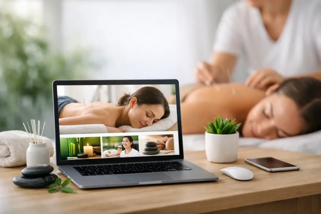
Why acupuncture web design matters more than most service websites
Acupuncture is a trust-based service. Before someone books, they usually want reassurance on three levels: that you are qualified, that your treatment is relevant to their problem, and that contacting you will be easy. A generic website template rarely addresses those needs well.
This is where many clinics get stuck. They invest in a visually pleasant site, but the structure is built around the business owner’s preferences, not the patient’s questions. The homepage talks too much about philosophy and not enough about outcomes. The navigation is cluttered. Booking details are hard to find. The result is a site that looks acceptable but performs poorly.
Effective acupuncture web design balances brand image with conversion strategy. It should feel calm and professional, but it also needs clear calls to action, strong local signals, and content that reduces hesitation. Good design is not decoration. It is guided clarity.
What patients expect when they visit an acupuncture site
Most first-time visitors are not comparing design trends. They are asking practical questions fast. Can this practitioner help with my issue? Is the clinic legitimate? What does treatment involve? Where are they located? How much effort will it take to book?
If those answers are buried, trust drops. If the answers are immediate, your conversion rate improves.
A high-performing acupuncture website usually makes room for a few essential elements. It should show a clear value proposition near the top of the homepage, explain services in plain language, present practitioner credentials without sounding stiff, and make booking visible on both desktop and mobile. Testimonials also matter, especially when they reflect specific concerns like back pain, migraines, anxiety, fertility support, or sports recovery.
There is a trade-off here. Some clinic owners want a very minimal website with only a few pages. Minimal can work, but too little information creates doubt, especially for people who have never tried acupuncture before. On the other hand, an overloaded website with too many treatment pages, pop-ups, and dense explanations can feel overwhelming. The goal is not more content. It is better-guided content.
The foundations of acupuncture web design that converts
The strongest websites in this niche usually get the basics right before adding anything fancy. Layout, messaging, speed, and local relevance do more for lead generation than animations or trendy effects.
Start with the homepage. It needs a clean headline that explains what you offer and who you help. Something specific will outperform something poetic. Patients respond to clarity. If you specialize in pain management, women’s health, stress relief, or holistic wellness, say it early.
Next comes structure. Your main navigation should be simple enough that a first-time visitor can find the right page in seconds. Home, About, Services, Conditions Treated, Reviews, FAQ, and Contact are often enough. If your menu has twelve competing items, it is usually a sign the site needs stronger prioritization.
Visual design should support the service, not distract from it. Calm color palettes, readable typography, real clinic photography, and generous spacing tend to work well. Stock images of bamboo, stones, and generic spa scenes can make the brand feel less credible if overused. People want to see the practitioner, the clinic, and the experience they can expect.
Mobile usability is non-negotiable. A large percentage of local health-related searches happen on phones. If your buttons are hard to tap, your forms are too long, or your page loads slowly, you are losing potential bookings before the conversation even starts.
SEO and acupuncture web design need to work together
A beautiful website that no one finds will not grow your clinic. That is why SEO should be part of the design process from the beginning, not added later as an afterthought.
For acupuncture practices, local SEO is especially important. Your site should clearly communicate where you are located, the areas you serve, and the treatments people might search for in your city or region. This affects page structure, metadata, headings, internal organization, and on-page copy.
It also affects your service pages. Instead of creating one vague page called Services, it is often more effective to build focused pages around real patient intent. For example, a page for acupuncture for back pain serves a different search intent than a page for fertility acupuncture or stress relief treatment. That does not mean creating thin pages for every possible symptom. It means building useful pages around high-value services and common patient needs.
This is where strategic planning matters. If the site architecture is wrong from the start, future SEO growth becomes harder. A personalized agency approach helps here because the right structure depends on your clinic’s size, market, service focus, and growth goals. A solo practitioner in one neighborhood needs a different setup than a multi-location wellness center.
Content that builds trust instead of sounding generic
Many acupuncture websites sound interchangeable. They use broad phrases like whole-body healing, personalized care, and natural balance without explaining what the patient experience actually looks like. Those phrases are not useless, but on their own, they do not persuade.
Better content is concrete. It explains the process, answers objections, and speaks to the patient’s reality. If someone is nervous about needles, say what treatment feels like. If insurance or pricing questions are common, address them clearly. If your approach combines traditional Chinese medicine with modern clinical understanding, explain that in a way that feels grounded and accessible.
The About page is another missed opportunity on many sites. This page should do more than list certifications. It should connect your expertise with patient confidence. Why do you practice? What kinds of cases do you commonly help with? What can a first-time patient expect from your care style? These details make the site feel human without becoming overly personal.
For brands that want premium positioning, this matters even more. A high-value client experience starts before the first appointment. Clean communication, thoughtful page flow, and clear expectations all contribute to that perception.
Common mistakes in acupuncture web design
One of the biggest mistakes is building the site around aesthetics alone. If the design is attractive but the messaging is weak, patients may admire the look and still leave without taking action.
Another common issue is hiding the conversion points. Contact details, address information, online booking, and consultation options should never feel buried. Every key page should guide the next step naturally.
Some clinics also over-explain acupuncture theory while under-explaining practical benefits. Educational content is useful, but it should be framed around what the patient cares about most. A visitor with neck pain wants to know whether you can help, what the process is like, and how to get started.
There is also the problem of outdated credibility signals. An old website with broken formatting, tiny text, and slow loading can create doubt even if your practice is excellent. People often judge service quality through digital presentation. Fair or not, that is how online decision-making works.
What a smart redesign should prioritize
If your current site is underperforming, the answer is not always a total rebuild. Sometimes the biggest gains come from improving messaging, page hierarchy, local SEO signals, and booking flow. Other times, the foundation is too limited and a full redesign makes more sense.
A smart redesign starts with business goals. Do you want more local appointments, better-quality leads, stronger positioning for a specialty, or support for future SEO growth? The design strategy should follow that objective.
This is where working with a team that understands both design and search performance makes a difference. At SEO Sin Fronteras, that kind of integrated thinking is what helps businesses avoid pretty websites that do not produce results. Especially in service-based industries, every page should have a job.
The best acupuncture web design is not about making a clinic look modern for the sake of it. It is about creating a site that earns trust quickly, supports visibility in search, and turns interest into appointments. If your website is not doing that yet, it is not just a design issue. It is a growth opportunity waiting to be addressed.